
Stap Reizen – #68f7b31fe4632441be5b9595
Test Details

Test Overview
This report details the findings of a visual asset pre-test conducted by BrandPulse for Stap Reizen. The primary objective was to identify which image captured the most attention from viewers, ensuring maximum visual impact and engagement. We leverage AI insights + human feedback to determine your highest-attention asset with confidence, utilising attention metrics, visual engagement patterns, and a Stopping Power Rating (SPR).
Type
Image Testing
Test period
7 days
Completion date
December 31, 2025
Test Assets

Image 1

Image 2

Image 3

Image 4

Image 5

Image 6
Location Targeting
Languages
Demographics
Male, Female, Other
Intent Signals
Passion Profiles
Life Milestones
Package Details
Platinum Package
Performance Overview
Best Performing Asset
Human Audience Signals
VS 60.000 bought audience signals
Confidence Level
Demographic Distribution
Gender Distribution
Age Distribution
Asset Performance
|
Asset |
SPR Score |
Audience Signals |
|---|---|---|
|
|
9224 |
|
|
|
7230 |
|
|
|
25148 |
|
|
|
7764 |
|
|
|
8957 |
|
|
|
5753 |
Detailed Asset Analysis
In-Depth Visual Analysis
Each asset has been analyzed using our proprietary AI-powered Visual Heatmap Technology , which identifies areas of high visual engagement and attention. The heatmaps reveal how users interact with different elements of each image, highlighting focal points and areas that drive engagement. This data-driven approach allows us to understand why certain visuals perform better than others and provides actionable insights for optimizing your visual assets.
View all assets
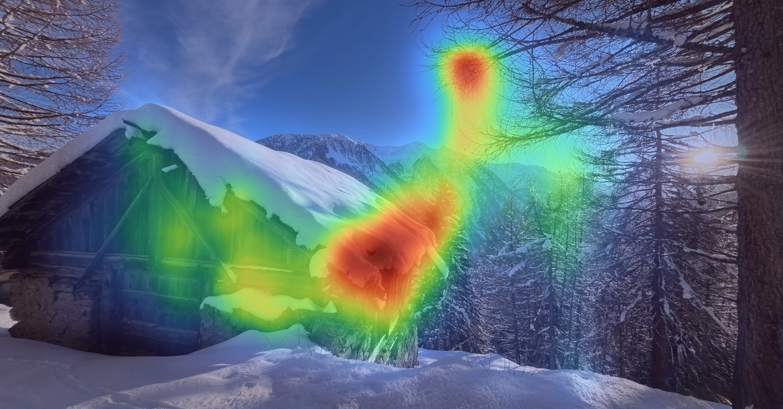
Image 1
AI Insights
Powered by AI
Why it works (and why it fails): The image captures attention through strong visual contrasts – the rough, warm brown texture of the cabin against the smooth, cool white snow creates an appealing tactile difference that draws the eye. The composition also uses effective depth layering with the cabin in the foreground, trees in the middle ground, and mountains in the background, which gives the scene dimension and makes it feel immersive rather than flat.
However, the image ultimately fails to hold much attention because it lacks a clear focal point. While aesthetically pleasing, there’s no visual anchor or area of interest that guides the viewer’s eye to a specific element. Without something compelling to focus on – whether that’s a person, an action, or an unexpected detail – the image reads as generic. Pretty, but not distinctive enough to make someone engage. The viewer’s eye wanders without purpose, and they quickly move on.
-
SPR Score 28
-
Probability to be Best 12.2%
-
Audience Signals 25148
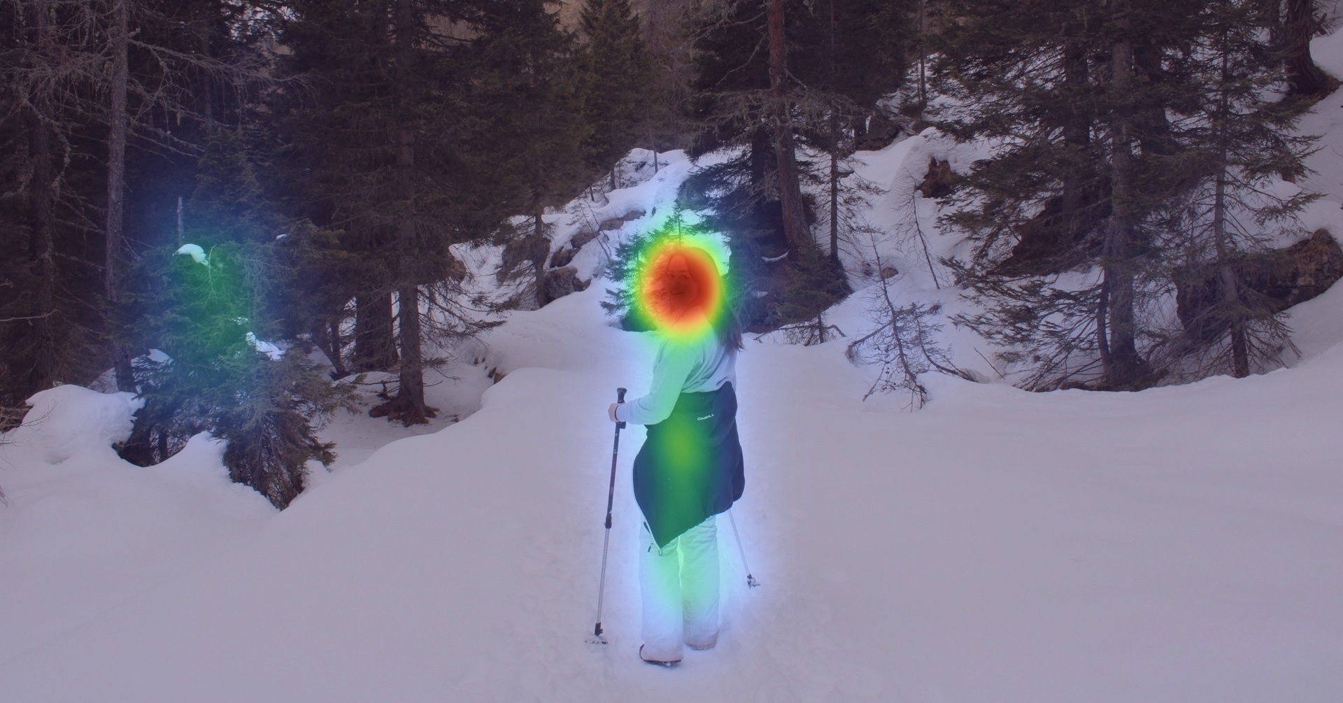
Image 2
AI Insights
Powered by AI
Why it works: The image succeeds in capturing attention primarily because of the human face – faces are hardwired into our brains as the most compelling visual element we can encounter. It’s essentially a cheat code for engagement. People instinctively look at faces first and longest, making this a natural focal point. Secondary interest flows to the person’s body, likely enhanced by the strong color contrast between the black jacket tied around her waist and the white snow, creating a visual anchor point below the face.
Why it doesn’t work as well as it could: However, the image fails to maximize its potential because the overall composition lacks visual pop and depth. The person’s predominantly white outfit blends too heavily with the snow, creating a flat, washed-out effect. Without sufficient contrast or separation from the background, the figure doesn’t stand out as dramatically as it could. The result is an image that captures initial attention through the face but doesn’t hold interest because there’s no visual tension or layering to keep the eye engaged. Everything feels like it’s on the same plane, reducing the overall impact.
-
SPR Score 15
-
Probability to be Best 0.4%
-
Audience Signals 8957
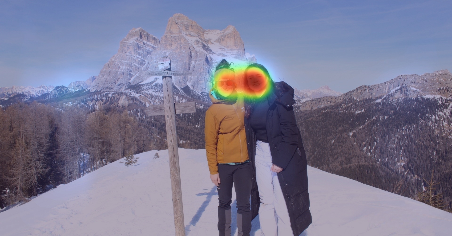
Image 3
AI Insights
Powered by AI
Masterclass in capturing attention: This image is a masterclass in stacking multiple attention-driving mechanisms to create maximum engagement. First, there’s powerful color contrast – the bright yellow jacket against the white snowy background immediately draws the eye. Yellow itself is the most visible color in the spectrum and naturally demands attention. Then you have not just one but two human faces, doubling the inherent pull that faces have on our attention. These faces aren’t neutral either – they’re smiling, and emotional expressions are particularly effective at capturing and holding viewer interest because they trigger our empathy and mirror neurons.
The image also employs strong depth through clear visual layering: the people in the foreground are distinctly separated from the tree terrain in the middle ground and the imposing mountain in the background, creating a three-dimensional feel. Finally, the composition follows the rule of thirds with the faces positioned in the top right, while the mountains fill the left half of the frame, creating visual balance. By combining color psychology, human elements, emotional cues, depth, and compositional best practices all in one frame, the image becomes difficult to ignore. It’s not relying on a single hook – it’s using several simultaneously, which compounds the stopping power.
-
SPR Score 34
-
Probability to be Best 52.2%
-
Audience Signals 9224
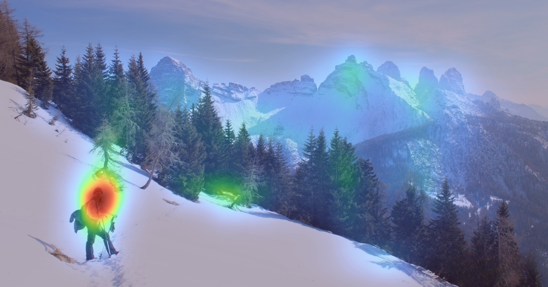
Image 4
AI Insights
Powered by AI
Why it fails: This image fails to generate meaningful engagement because it lacks any clear focal point – it’s simply a landscape with no subject or area of interest to anchor the viewer’s attention. When attention is diffused across an entire composition with nothing specific to latch onto, the brain doesn’t register the image as worth processing.
-
SPR Score 5
-
Probability to be Best 0.1%
-
Audience Signals 5753

Image 5
AI Insights
Powered by AI
Why it works (and why it fails): The image succeeds in creating visual flow through natural leading lines – the footmarks in the snow and the slopes guide the viewer’s eye directly toward the person’s figure, creating a clear path for attention to follow. The composition also uses effective depth layering with the snow in the foreground, trees in the middle ground, and mountains and sky in the background, giving the scene a three-dimensional quality that draws viewers into the frame.
However, the image fails to maximize its impact because the person’s black outfit blends too heavily with the dark trees behind them. While the leading lines successfully direct attention to the figure, the brain then has to work harder to visually separate the person from the background. This creates cognitive friction—the viewer’s eye arrives at the intended focal point but struggles to clearly distinguish what they’re supposed to be looking at. If the brain has to work to decode the image, most viewers simply won’t bother and will keep scrolling. The figure needed more contrast or separation from the trees to make the payoff worth the journey the leading lines created.
-
SPR Score 21
-
Probability to be Best 4.2%
-
Audience Signals 7764
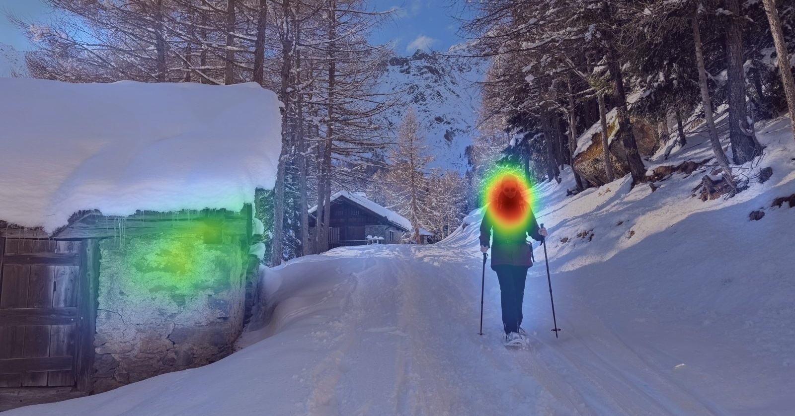
Image 6
AI Insights
Powered by AI
Why it works: The image successfully captures attention through multiple strategic visual elements. The person’s face serves as the primary focal point – leveraging the human tendency to prioritize faces above almost anything else. The brown tones of the cabin create strong color contrast against the white snowy landscape, providing a secondary anchor for the eye.
Most importantly, the vibrant blue sky creates both color and brightness contrast against the rest of the relatively muted composition. Because the blue sky is framed centrally in the composition, it likely acts as the initial scroll-stopper. Only after that initial capture does attention naturally flow to the person’s face, which then holds the engagement. This creates a two-stage hook: the sky stops the scroll through bold contrast and central positioning, and the face keeps attention through biological imperative. By stacking these elements – striking sky, human presence, and color contrast – the image creates multiple entry points for viewer attention, making it difficult to scroll past without noticing it.
-
SPR Score 29
-
Probability to be Best 29.9%
-
Audience Signals 7230
Statistical Analysis
Explanation of Tests
Chi-Square Test
Tests whether the differences in click behavior across all assets are statistically significant.
Result: Significant at 90% confidence (p = 0.0522)
Z-Test
Compares the top-performing assets to each other asset one-by-one.
Result: Significant when compared to Image 2 at ~80% (p = 0.21), and Image 4 at 95% (p = 0.03). Insignificant when compared to the other assets.
Bayesian Test
Estimates the probability that each asset is truly the best.
Result: Image 3 has 52.24% probability
Statistical Significance Matrix
|
Image Asset |
90% Confidence Level Chi-Square Test |
% Confidence Level Z-Test |
Bayesian Best Probability |
|---|---|---|---|
|
|
p = 0.0522 |
- |
52.2%
|
|
|
p = 0.0522 |
1.00 |
29.9%
|
|
|
p = 0.0522 |
1.00 |
12.2%
|
|
|
p = 0.0522 |
1.00 |
4.2%
|
|
|
p = 0.0522 |
0.21 |
0.4%
|
|
|
p = 0.0522 |
0.03 |
0.1%
|
Key Insight: The Power of Human Connection
The top-performing images (3, 6, 1) dominated by using human faces – a powerful attention mechanism, with faces fixated 16.6 times more often than comparable elements and over 65% focused on within the first two fixations.
Image 3 specifically excelled by stacking direct eye contact from two faces, color contrast (yellow jacket, pink headband against cool blues), high texture contrast between sharp mountain peaks and smoother foreground features, and symmetrical Gestalt composition.
Images 6, 1, and 5 maintained strong performance by combining faces with curved pathways, high-contrast architectural elements, near-space positioning, and color pops.
The bottom performers (images 2 and 4), despite strong texture contrast and defined edges from mountainous landscapes, lacked human elements and relied solely on lower-level visual features that cannot compete with faces’ automatic attentional capture.
When maximizing attention is critical, incorporating human faces with direct eye contact provides an evolutionary hard-wired advantage that scenic content alone fundamentally cannot match.
Recommendations & Next Steps
Implement Top 4 Assets
Use “Image 3” as visual across the majority of digital touchpoints while experimenting with “Image 6”, “Image 1”, and “Image 5”
Faces Win
Focus on images with human faces and direct eye contact with the camera for next time. Combine this with other attention grabbing features such as using the color yellow, contrasting it with a plain background and having various different textures in the image.
Follow-Up Test
- Use more human faces
- Use more warm colors
- Experiment with contrasting colors and textures
Based on the data-driven insights from this test, we recommend implementing “Image 3” as your main visual while experimenting with images 6, 1, and 5. Future testing could explore the use of more human faces and warm colours combined with contrasting features.